If you’ve ever wandered through the city of Rotterdam, you know it has a unique vibe—part modern marvel, part architectural experiment. The skyline looks like a gallery of ideas, where each building competes not to be taller or flashier, but more interesting. Among this futuristic forest of glass and steel, one building stands out both for its bold design and its vibrant color—the Red Apple Building.
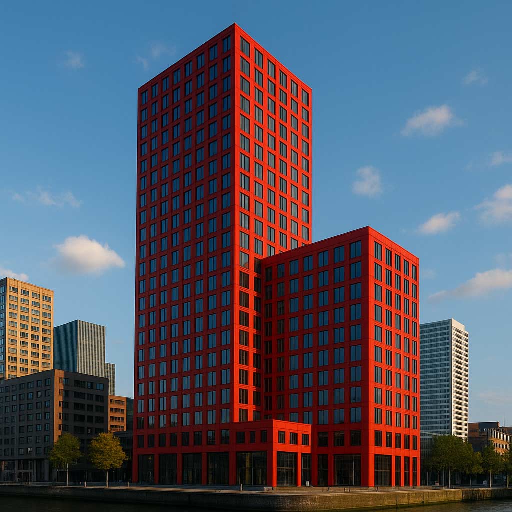
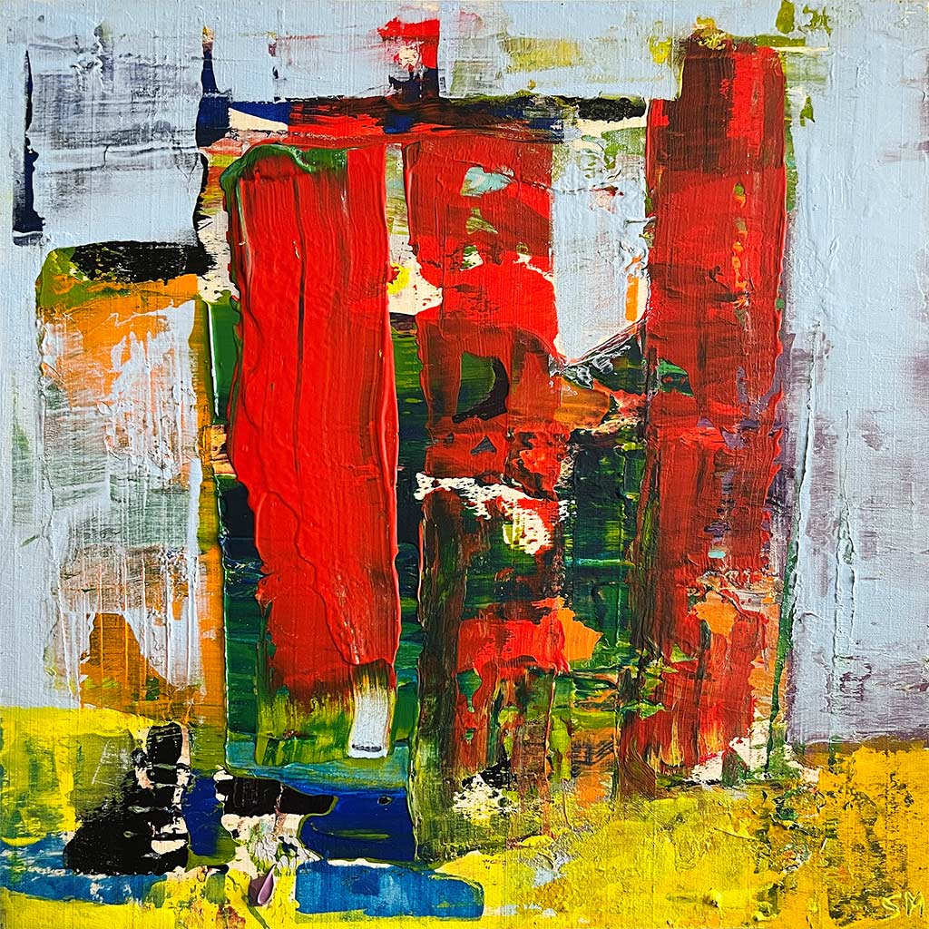
Rising above the old harbor area known as Wijnhaven Island, the Red Apple is impossible to miss. Its deep red façade gleams like polished fruit in the sunlight, giving the area a sharp, energetic visual punch. The building is both an architectural statement and a love letter to the city’s ongoing reinvention. And fittingly, artist Shawn McNulty captures this same essence in his abstract painting “Rotterdam.” In his work, a large red vertical form pushes upward against a blue and yellow backdrop, echoing the building’s strong shape and the dynamic spirit of the city itself. The painting feels alive—modern, bold, and full of motion—just like the building that inspired it.


Rotterdam’s Spirit of Reinvention
To understand the Red Apple, you have to understand Rotterdam. This port city has always been about progress. After being heavily bombed during World War II, Rotterdam didn’t just rebuild—it reinvented itself as a hub of modern architecture. Instead of trying to recreate the past, the city chose to look forward, giving rise to some of the most innovative structures in Europe.
The Red Apple is one of those bold statements. Completed in 2009, it was designed by KCAP Architects & Planners in collaboration with Jan des Bouvrie, one of the Netherlands’ most well-known designers. It combines residential living with commercial spaces—a “mixed-use tower” that embodies the modern idea of urban life: living, working, and relaxing all in one vertical environment.
Why “The Red Apple”?
The name might sound quirky, but it has layers of meaning. First, it’s a direct nod to the building’s bright red color, achieved through specially coated aluminum panels that shift tone depending on the light. At sunrise, it glows orange-red; by evening, it deepens into a rich crimson.
But there’s more to it. The name also references the Dutch idiom “rode appel,” a term historically used to describe Rotterdam’s harbor area—a once gritty, industrious zone now transformed into something fresh and appealing, much like an apple being polished to a shine. The Red Apple represents that transformation: the city’s shift from industrial roots to a vibrant, creative metropolis.
McNulty’s painting captures that same symbolic duality. In “Rotterdam,” his red vertical form rises powerfully from a blue and yellow field, colors that can be read as sky and light, or water and energy. It mirrors the city’s mix of natural and industrial elements, of old harbor life meeting new cultural ambition.
The Design: Elegant Geometry and Urban Energy
At 127 meters (417 feet) tall, the Red Apple isn’t the tallest building in Rotterdam, but it’s certainly one of the most eye-catching. Its geometric pattern of red and gray panels gives it a kinetic quality—as if it’s vibrating with city energy. The façade’s rhythm changes depending on the angle, and at night, the building transforms again, with interior lights flickering through the grid like stars in motion.
The structure consists of two main parts: a tall residential tower and a lower building housing offices, retail, and restaurants. Together they form a cohesive architectural composition, connected visually through the repeating red motif and clean vertical lines. The design reflects KCAP’s philosophy of urban harmony—modern buildings that respect and enhance their surroundings rather than dominate them.
Inside, the apartments offer floor-to-ceiling windows with panoramic views of Rotterdam’s waterways, bridges, and skyline. Residents live within the very pulse of the city, watching cargo ships, trams, and cyclists all flow in rhythm below.
Red as an Attitude
Color plays a massive role in how we experience architecture, and the Red Apple proves that buildings don’t have to hide behind neutral tones to be sophisticated. Red, in this case, isn’t just decoration—it’s identity.
In psychology, red is associated with strength, passion, and warmth, all qualities that fit Rotterdam’s spirit. The Red Apple’s designers wanted to make something that felt alive, a structure that could embody the energy of the people who live and work inside it. That emotional boldness is what McNulty taps into in his abstract painting. His red shape feels like both a building and a living pulse—something breathing within a cityscape. The blue and yellow backdrop around it feels open and optimistic, like air and sunlight moving through urban space.
A Symbol of Modern Rotterdam
Today, the Red Apple stands as a landmark of Rotterdam’s creative confidence. It’s part of the city’s broader architectural narrative that includes other icons like the Cube Houses, the Erasmus Bridge, and the Market Hall. What ties them all together is a willingness to experiment—to blend art, architecture, and lifestyle in unexpected ways.
The Red Apple area itself has become one of the city’s trendiest spots, with cozy cafés, floating bars, and scenic harbor views. The building doesn’t just dominate the skyline—it shapes how people experience the neighborhood. It’s both a landmark and a backdrop for daily life, much like how a painting can both command a room and subtly influence its atmosphere.
The Connection to Art
There’s a beautiful connection between architecture and abstract art, and McNulty’s “Rotterdam” highlights that bridge perfectly. His painting isn’t a literal depiction of the building but rather an emotional translation of its presence. The bold red vertical shape could be seen as the Red Apple’s silhouette, while the surrounding blue and yellow areas hint at sky, reflection, and movement—the city’s constant flow.
McNulty often plays with contrasts, and here, the contrast between warmth and coolness mirrors Rotterdam’s own dual character. It’s a city that’s both industrial and inviting, structured and free-flowing, historical and future-focused. The painting, like the building, captures this in one striking visual statement.
Redefining Urban Life
The Red Apple isn’t just an architectural gem—it’s a symbol of how cities evolve. Rotterdam continues to reinvent itself, layering history with innovation. Each building, bridge, and plaza adds a new brushstroke to the city’s abstract portrait.
From certain angles, the Red Apple reflects in the harbor below, its red façade mirrored in rippling blue water. It’s the same tension of opposites that McNulty explores—red and blue, vertical and horizontal, energy and calm. His painting “Rotterdam” turns that architectural drama into something deeply human and emotional, transforming glass and metal into color and rhythm.
Fire in the Skyline
Ultimately, both the Red Apple Building and McNulty’s painting celebrate the idea of vitality within structure—how design can express life itself. The building’s color burns against the cool Dutch sky, a beacon of creativity that feels like the city’s heart beating in real time.
Just as the painting “Rotterdam” freezes that energy into a moment of color, the building captures it in steel and glass. They both tell the same story: that modern beauty isn’t quiet or restrained—it’s bold, bright, and unapologetically alive.
So next time you see a photo of the Red Apple or McNulty’s vivid abstract “Rotterdam,” imagine the feeling of standing beneath that red tower, sunlight bouncing off its panels, with the wind from the harbor on your face. It’s not just architecture—it’s art, energy, and optimism made solid.